Heya,
So a change of pace I figured I'd put the obligatory video up before the post instead of after. Because hey, it might give you some atmosphere or something while skimming through my posts. Much more enjoyable I figure.
Either way....
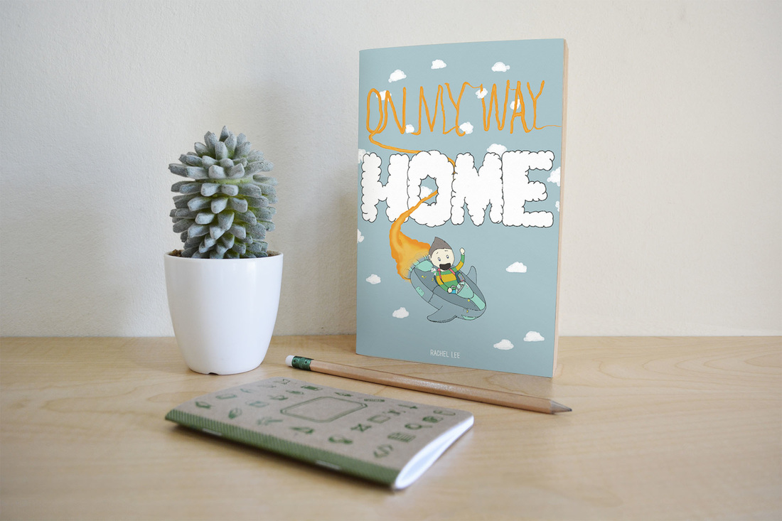
I needed to get this done since my time on the project is up. I'm fairly happy with what I have though. If you need a reminder here is the brief from BriefBox.
Here is what I ended up with:
So a change of pace I figured I'd put the obligatory video up before the post instead of after. Because hey, it might give you some atmosphere or something while skimming through my posts. Much more enjoyable I figure.
Either way....
I needed to get this done since my time on the project is up. I'm fairly happy with what I have though. If you need a reminder here is the brief from BriefBox.
Here is what I ended up with:
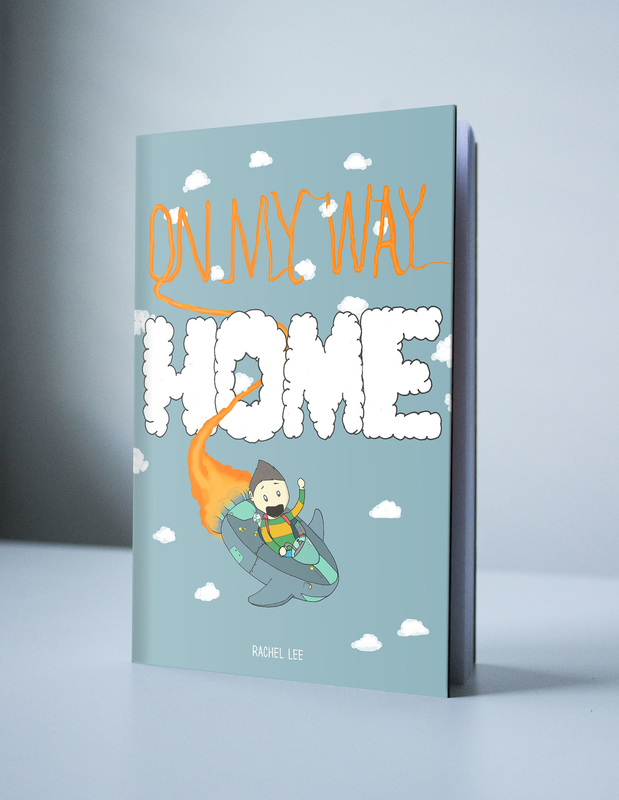
Overall I like it. Are there things I would change? Sure, but I'm not upset with the result. This is also going to be the start of me using mockups for everything. It makes everything look better and I'm going to need to know how to use them.
So a few points that I just want to touch on. Firstly, like I talked about last time I hated the kids face so I did just buckle down and re-did it.Its better by far, but could still use some work. Maybe a nose? I don't know... I think I really need to work on the eyes and if I had those better it would be able to sell it more.
Maybe I could have anchored the bottom with something? I enjoy the top because there is interaction between everything up there but the bottom kind of falls off. Leaving the cover seem really imbalanced. I'm thinking I could have put some mountains or something in the bottom. Or better yet, another cloud.
Although what could be a better answer to this issue could be avoiding what I just said and go with a texture. It is really possible that a big cloud or another element in the bottom would just be to much. The cover works so far because for the most part it is pretty simple. So maybe a subtle texture could have kept the blank space interesting enough for the eyes to linger around.
I also posted this to
Behance and BriefBox
You like the book cover but want to see more pictures I took with my camera? Ok I guess....
Behance and BriefBox
You like the book cover but want to see more pictures I took with my camera? Ok I guess....
You could say I'm a Knobivce... (I'm sorry)
That's it!
 RSS Feed