Hi!
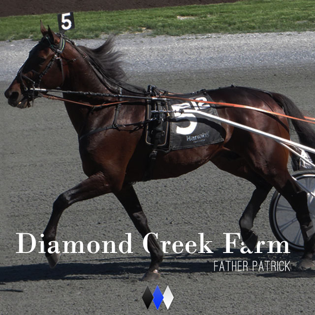
So I just finished a little quick project. Hopefully this is going to be an ongoing thing so I should have a decent catalog of ideas when all is said and done. What did I do? Well, I made some promotions for a horse racing company to be used on Instagram and Twitter.
Only had a few hours to work on this though so I wasn't going to go nuts.
I decided early on that I was going to let Instagrams built in filters do most of the heavy lifting. All i did with the image was crop it and add a tad more space on the left hand side. His nose was rubbing the border before. I also darkened it by a bit and tried to get rid of the massive amount of glare that was happening all over.
After that I messed around with type and placement a whole bunch.
I chose Bodoni because it offers the right feel for this company. I was also thinking that it would be the font to give me the most flexibility in other forms of media like print as well.
I chose some crazy things with this but stuck to something simple. It is supposed to be used all year, so something nice and clean would do the trick.
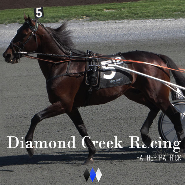
Now are there problems with this? Sure! lets talk about three quick ones.
Firstly the "C" in the racing one bugs the heck out of me. I need to go in and unclip some of that leg. The C is extending to far. Also in the same picture the A in diamond is positioned in an odd part of the hoof so that it looks slightly clipped by it even though it's not.
Second is the diamonds. That is the places mark so I don't know how much I can do with it. It is really too flat for my taste and I think it is the weakest part. It stands out but in a weird way. Also I wanted it to be smaller by a few pixels.
Thirdly? MARGINS!
They went with the "Farms" one it looks like. Check them out on Instagram and Twitter at diamondcreek_farm !
Since I've picked up meditating in the past week I thought I'd keep in the theme with the video!
 RSS Feed