 Well last semester is finally here. So that's exciting. Back at school and with a day off (free Wednesdays!) I got some work done on the map. I put it down for awhile so I could be a good person and show my girlfriend around Pittsburgh. I want to start churning out a project every one or two weeks; the map should be done by the end of the week either Friday or Saturday to make that happen. I'm at a decent stopping point I think and I can get back to it tomorrow after I get some fresh eyes, and a printer. Overall I'm happy with what I've done so far. This is the first of a couple things. This is the first time I've done something centered around drawing with pens, which reminds me this Staedtler pen is pretty sweet. I caught myself going down the vector route and I'm glad I turned around, stopped what I was doing and went about it the way I did. I made it difficult on myself because of this original misstep though, because I needed to draw over the original twice with pen. I definitely like working with pen though and I am definitely going to work this way in the future. The second thing that was a first for me was painting in Photoshop. Also realizing my scanner can scan up to 1200 dpi. I don't know how I didn't know that before but I'm glad I figured it out now. What a world of difference it makes! I decided to work with 600, because 1200 takes forever, I don't need something that high, and the file would be huge. While 300 was probably fine I just wanted to make sure everything was picked up and was already around the same darkness of the ink already. Like I said this was my first time painting in Photoshop, and it's awesome! I'm probably not going to go to much further with coloring with this project but there is a lot I want to do. I'll stop talking now and just show what I've been working on. |
 This is the lame vector image I was working with, till i realized that I can do so much more. | 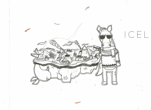 Additions I drew on with pen after I just turned everything into .5 or .25 lines. I made a mistake and scanned this in and tried to use it. Because of the old illustrator lines I didn't use and smudging it was very messy and I had to back track. |
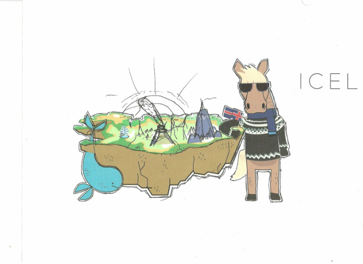
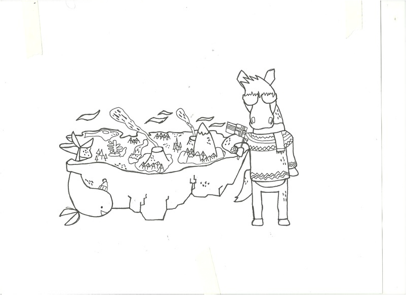 Taking a step back I made a light desk and traced over the old drawing and came up with this after a couple of tries. Much cleaner. | 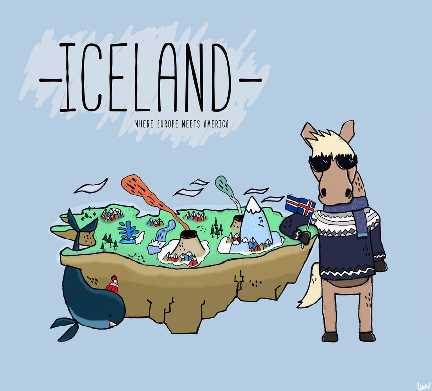 Full color! click the picture below for a bigger image. |

Issues I have right now with this is the horse first and foremost. I like him a lot, but at the moment he is just kind of floating there, so I need to think of a way to make him fit a bit more. Also not sure the hyphens are needed on Iceland. The rock/ground of the island I think is actually to smooth. I want/need to get this to a printer that isn't mine and really see what it looks like before I pick it apart to much.
Something cool that I noticed was that when I remove the lines on the picture and just leave the strokes it looks just like the animation in "Get Busy Living" by Goldfish. Definitely something I'm going to have to play around with!
Something cool that I noticed was that when I remove the lines on the picture and just leave the strokes it looks just like the animation in "Get Busy Living" by Goldfish. Definitely something I'm going to have to play around with!
 RSS Feed