The capstone is nearing it's end and it is such a scary monster. So I've spent the last two weeks working on it to try to get i minimum viable product out. Can't say I have, but don't tell my teachers that. Although I have been getting pretty close. It's looking more achievable but its like getting lost in a forest when I actually sit down and do it!
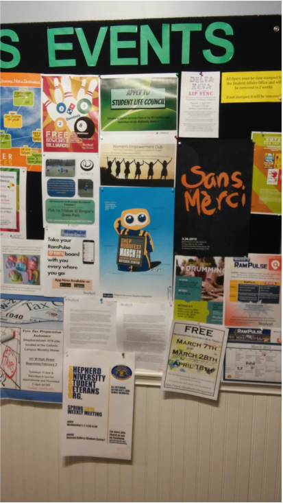
With that out of the way I'm here to sit down for a bit and talk about this poster! In the end I went with what I had last post minus a few tweaks.
Are there things that I would do differently? Sure, but something needed to be finished and i'm still happy with it.
I'd really like to talk about what I think it does well, and of course not so well and get into my process a bit.
Pluses
-It stands out from the clutter. Thanks to the bright colors, the blue in particular.
-its inviting. The pose of SCAMP isn't aggressive, and more submissive. So it should bring people to a more comfortable level when looking at it.
-on a similar note its friendly.
-It also works for target audiences. SCAMP's level of cuteness and bright colors of the poster are there to drag in the kids from middle school. SCAMP also comes with bad robot jokes to drag in college nerds who get them, and hopefully one of those lines goes over most parents heads.
- I keep harking on it, but the friendless is what makes it attractive. Its neither really feminine or masculine so it works to not alienate either gender group.
-There is a level of interaction because of the jokes that the competition doesn't have. If someone takes the time to read it, this should make it that much more memorable.
- It displays all the information I was given to display in a readable way, although there are some missteps. Which ill get into here in the next section.
Minuses
-well nothings perfect sadly.
-No time is listed. This is a stinker because I never actually got one even though i asked for a couple weeks about it, but oh well.
-The list of robot modes looks funky. In the end i'm ok with it. However If I has a second go I would want to play around with it some more. It looks weird because it is to heavy in relation to all the other shout outs poking out. Specifically there is another one on the other side of SCAMP which makes it look really unbalanced. It might benefit from being moved to above his head near the off center a little bit to the left.
-Generally needs to be bigger, i think it works but in general everything is to small. Wether this means throwing out the funny lines I don't know. Its readable from a distance but It could definitely use some improvement.
-Sans Merci, why anyone would want to name the art programs publication "no thank you" is beyond me.
-The shepherd logo is disgusting larger than 11x17 although it makes sense, its still upsetting.
-The stamp, I wish I thought that it was going to get stamped and planned for it, Would've been SO MUCH COOLER. Now it's just a missed opportunity.
 It came so far
 Lets talk about how I did it
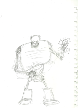
Well I'm glad with how I went about the project for the most part. The most difficulty I had was formulating an idea. Not because I didn't have any but because my plan totally fell through. The idea was to have three rather stoic robots standing together with the relevant information welded on their chests. The bad news was I lost two weeks I had to work on this due to that bad break up. :( Though even worse news was I realized I didn't really have enough information to actually display on three chests. So I had to set out and find a different approach.
I went through quite a few iterations, for awhile I was thinking in the realm of "Robots" the movie. But then I got hung up on my idea of a cute little robot selling cotton candy dressed like he was selling it at a baseball game. So cute I know.
So i decided to go down this road with the cute robot. It's no secret I prefer making happy things so I thought it was a good idea. Actually just thinking about the idea again I want to draw him so bad now...
I tossed out the cotton candy seller for the sandwich board because I wanted to have all the information stacked and in one central location. Again thinking back on it I could still have made him a cotton candy seller. So I drew this guy up scanned him in. I made the official decision to make this "clean" so I used illustrator to make the lines even and pose him a bit. At the moment he looked like the Coppertone tone girl.
Now my biggest moment of weakness came when I actually had to color SCAMP. I was lazy here and it made everything inconvenient from there on out. I should have colored him in illustrator, but since I drew him without closing mostly any paths my god it was going to be a pain. So I just exported him to Photoshop and used the bucket to fill in areas quickly.
How did this hurt me?
Well off the bat SCAMP wasn't finished and It took me a while to get the pose and all the details right. So every time I changed anything on him I needed to go back and re color him. So it added an extra step in my workflow.
It also caused a weird orange glow to come off of his face to the left. This is more my mistake than it is Photoshop's but it wouldn't have happened if I wasn't in illustrator. Basically what happened was I colored something with the brush tool to cover a line and let some escape the borders. I didn't notice this till to late.
It robbed me of convenient gradients. SCAMP would have stood a lot more and been more dynamic.
I'm sure there are more reasons, but lastly It was lazy and was not best practice. It's a good idea to do things right the first time to avoid this becoming a habit. So I should have bit the bullet and got down to doing it the correct way.
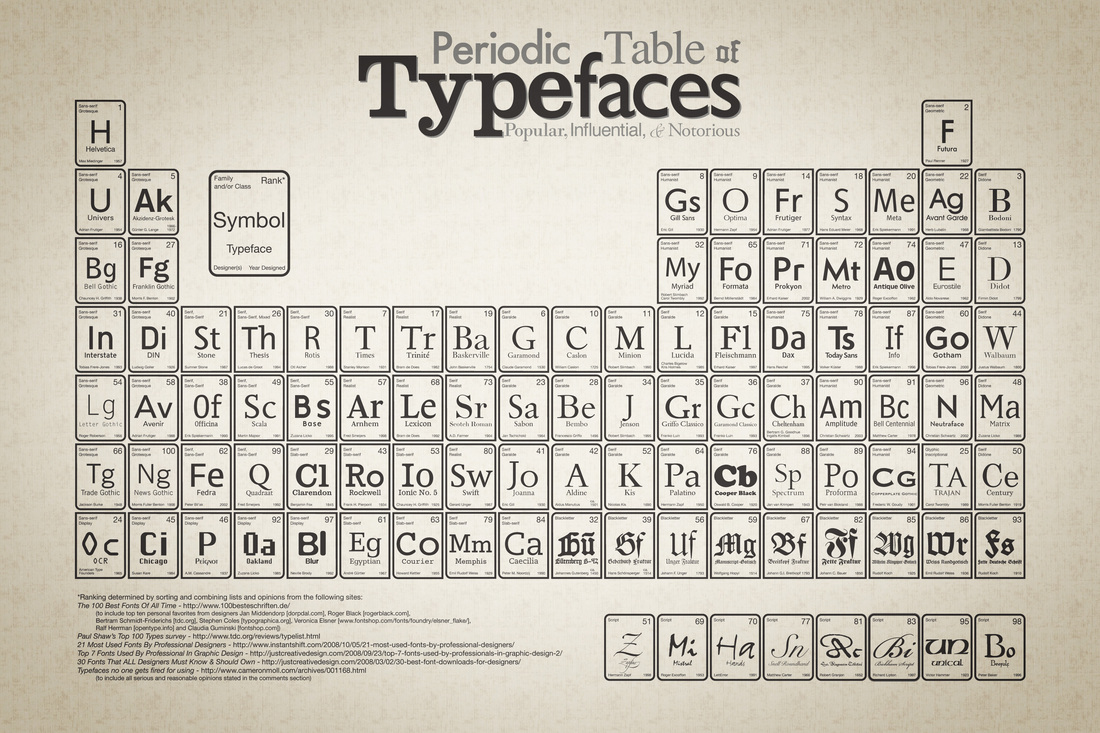
As for text it was fairly simple. From the get go i wanted to emulate a sign like this. I decided to use League Gothic as my main font. Why? Because I really enjoy it! I also think its reserved enough... Probably not the best reason, but still.
League Gothic worked for most of it. however it would certainty not work for the title ShepRoboFest. It is so reserved and doesn't allow any sense of freedom, or personality. I needed something that was more fun. I was looking for something that emulated "tech" no matter how cheesy that is that is what I looking for. There is a bunch of fonts that were very techy and very flashy but I stuck with Agency because the others were tacky. More importantly it is legible at lots of distances and fits the bill for what I was looking for.
For the little comments poking out, I was looking for Futura all the way quite frankly. I don't have Futura so I went with TW Cen which I think is its close cousin. The reason I went with this is because of its sterile nature. It is clean and provides a "futuristic" feel.
The colors were chosen out of what I was limited to, and the background was an allowance that was awarded to me and was added for eye grabbing potential.
That really took awhile didn't it?
I'm going to wrap this up with a few details on my future plans.
Firstly iv'e dropped the Sunday is for Homework poster. I colored it quickly the other day and found I really have no interest for it anymore. Really it's just a fragment of the Troubles that I had a few weeks ago so I'm going to put it down and move on to other things.
What I am going to move on to is that robot selling cotton candy! Its going to be super adorable.
I'm on spring break right now so I really need to get progress on the two sites that I'm supposed to be making. Cutie 2.0 should be an easy thing to work on while i do those.
 RSS Feed