Ok, it's been awhile I understand...
After some text felt heartbreak(who does that?), I'm back on the horse and have churned out this.
After some text felt heartbreak(who does that?), I'm back on the horse and have churned out this.
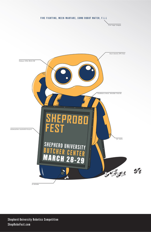
It's definitely not done yet. Though I think it Is an improvement on the old one. Off the bat tweaks that I want to make are, the nuts and bolts need to be consistent with each other and brought into the fold of the overall picture a bit more.
The Website address is making me have fits, the spacing between it and the bottom is also poor but it's better than the spacing between the letters. Then the spacing of ShepRobo Fest to the borders of the sandwich board is annoying, particularly the right side. Fooling with the left edge might fix it.
Overall I like it and I hope everyone else does too.
 RSS Feed